July 2017
Vaughan & Blyth
Building a brand
The problem
Vaughan & Blyth is a family business, founded in 1949. The company is now a big local name in the property development industry, and is responsible for a number of large works in and around the Colchester area.
The problem was two-fold. Firstly, Vaughan & Blyth was a business that hadn’t rebranded in 68 years, and was still committed to doing things the old-fashioned way. They had no website, no digital presence, and beyond a simple type-based logo, no real brand. Secondly, the Vaughan & Blyth business had split into two, leaving two businesses with identical brands operating in the same town.
Vaughan & Blyth approached me to not only bring them into the 21st century, but also to rebrand them, and help the property development side of the business stand out against its competition.
Process
The existing green colour was by far the most important part of the existing brand, so all I did was brighten it slightly (choosing Pantone 362 C as the brand’s key colour). My research into their competitors’ brands showed that branding in this area was overwhelmingly masculine and unfriendly – we wanted to go against this.
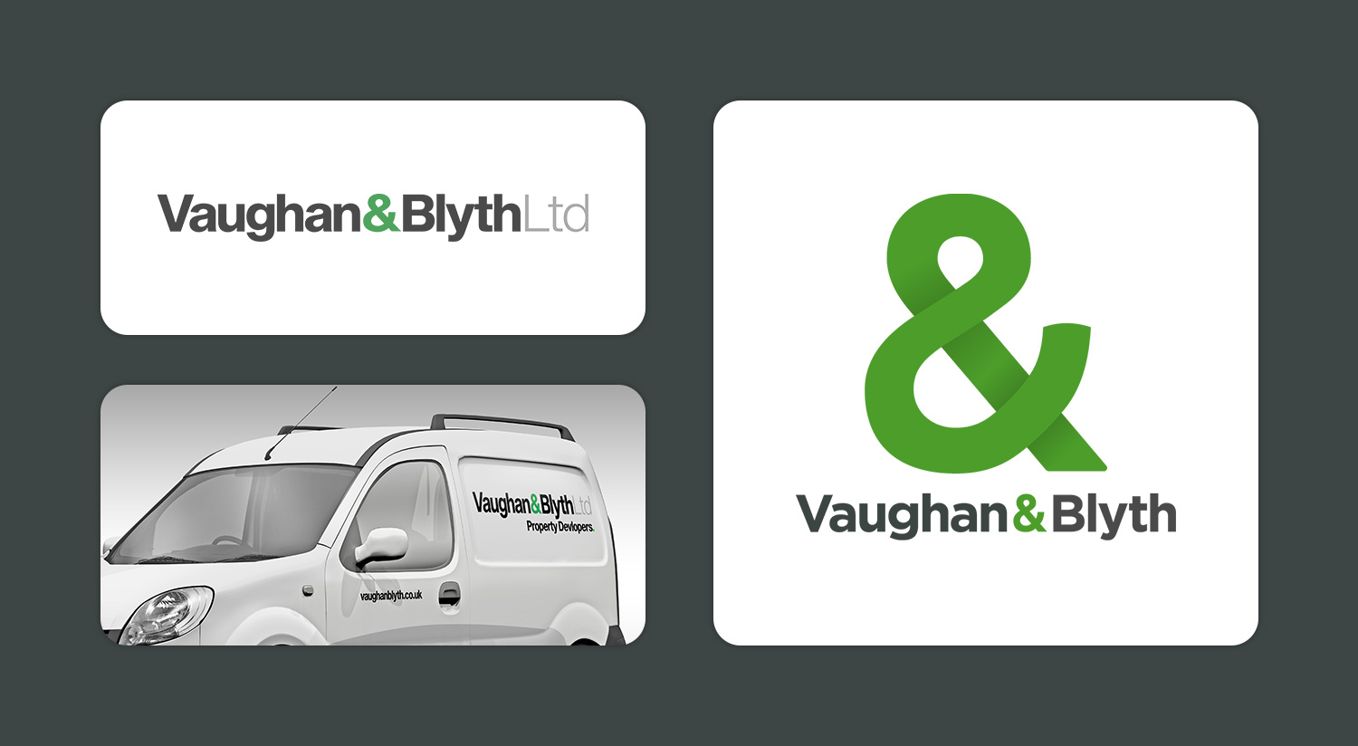
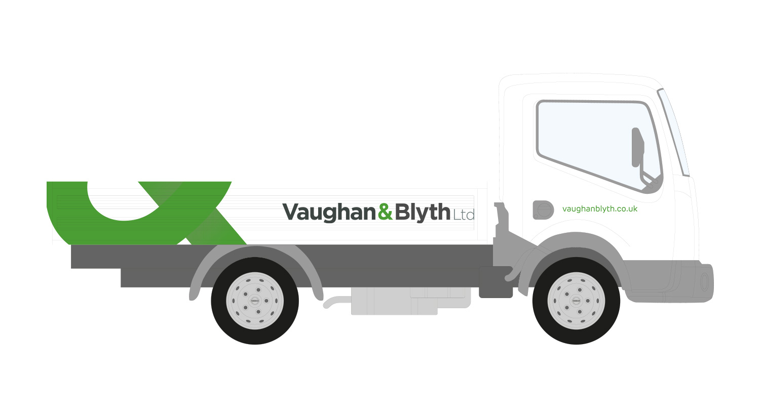
Research done, I went to Vaughan & Blyth with two main proposals, which each explored a different visual approach. The proposals mainly focused on the logo with some examples of applications around the logo, such as vehicle livery, with the aim of giving a general overview of the direction without having to go into too much detail.
Ultimately, we settled on the approach which used the ampersand (&) symbol as a bold, ownable icon. The company directors told me that to them, the ampersand represents the link between the two families that have made the company so successful over the last seventy years, so it seemed natural to focus in on it. Armed with list of deliverables, including things like the website design, stationery and liveries, I started working to create a modern design that still respected the roots of the company.
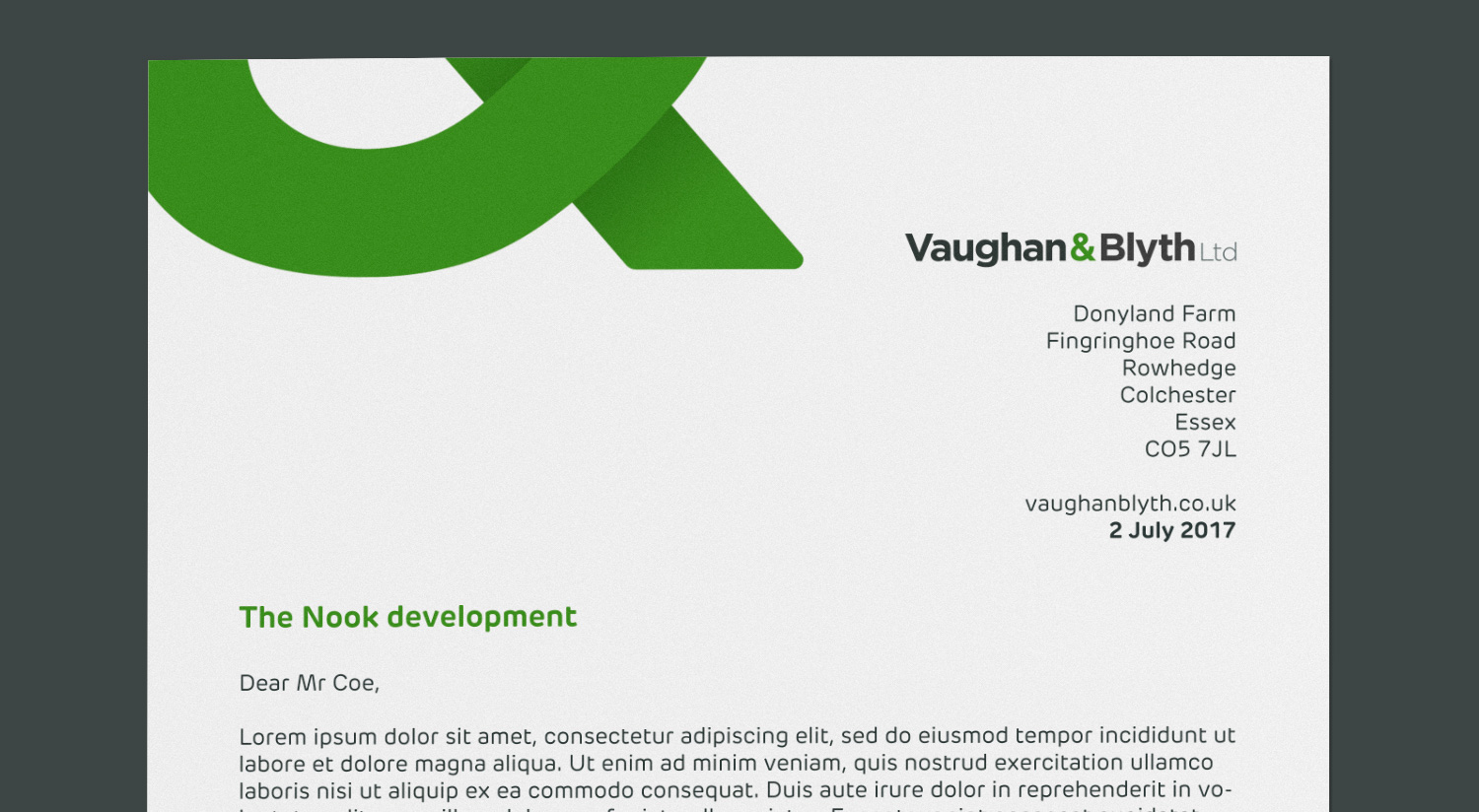
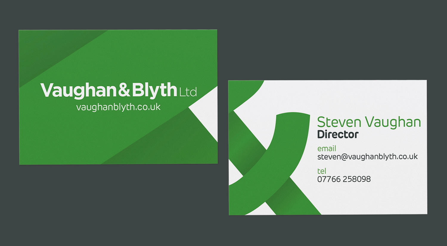
&!
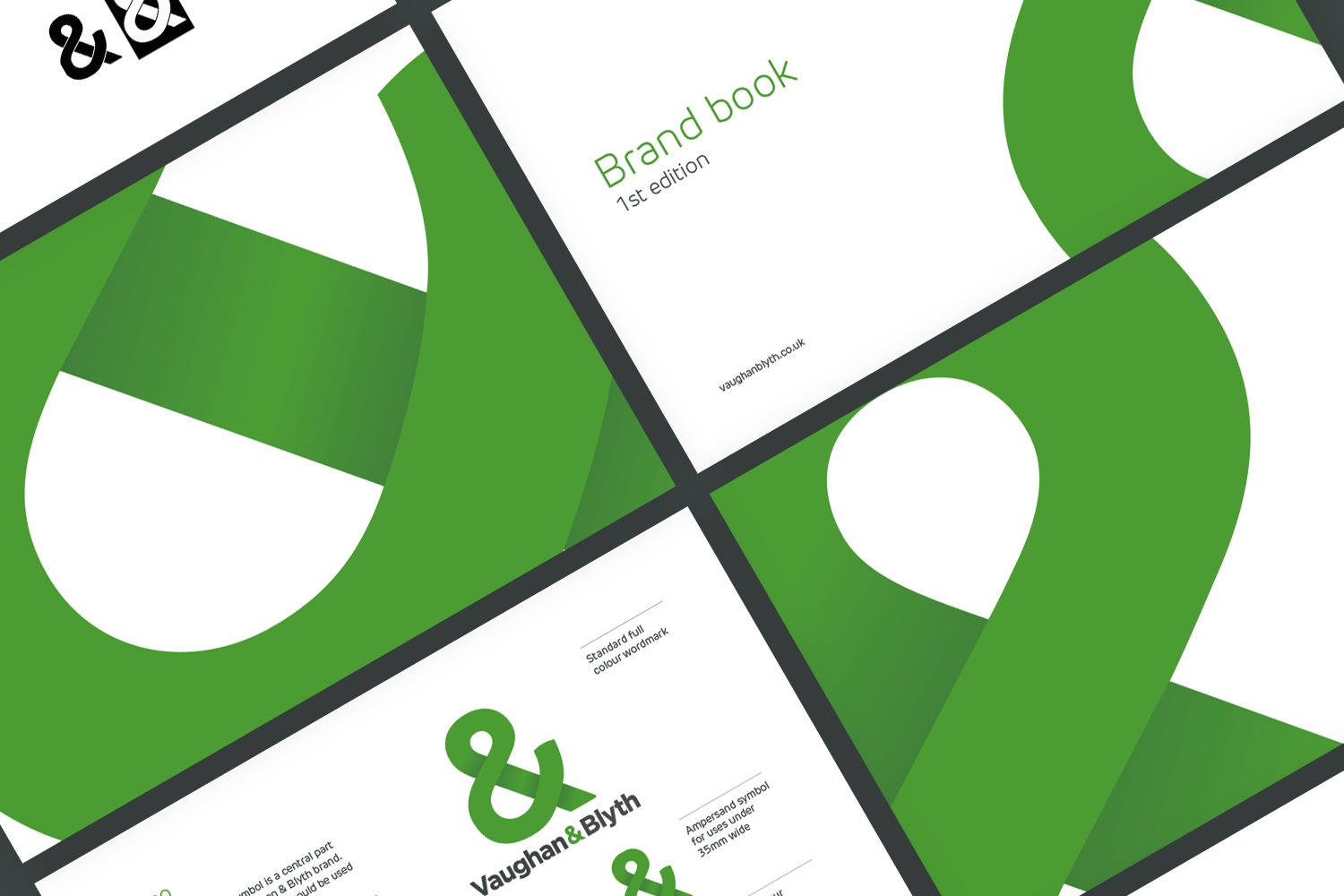
The ampersand provided a really unique and versatile visual device to work with. I used shading to add some more depth and interest to the icon, as well as modifying the actual shape of the character to make it a bit more visually balanced and comfortable.
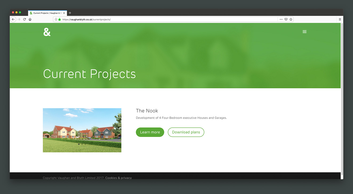
I eventually settled on an approach which used ‘cut-outs’ of the symbol, accompanied by the full wordmark. This allows the icon to fit into any shape or container it needs to, and also left me with potentially infinite ways of using the icon. As per the brand book, any cut-out that kept the shape recognisable as being an ampersand was fair game.
With this approach in place and approved by the directors of the company, it was then simply a case of finding the most effective and visually interesting way of applying it to different situations.
Reflection
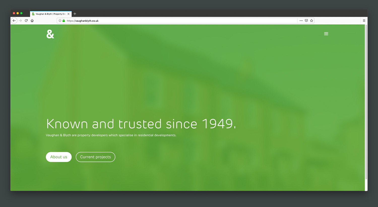
The rebrand and new website for Vaughan & Blyth is effective in repositioning the once old-fashioned company as a modern, forward-thinking brand, and it also helps to differentiate between the two Vaughan & Blyth-s that are operating in the same town!
This project was my first experience working on designs for less conventional situations, like vehicle livery and high-visibility clothing. These brought new challenges with them, but by maintaining close contact with other people involved, like those responsible for printing the designs, I was able to overcome these challenges and produce both technically sound and visually effective designs. The rollout of the new brand has been slow, but the company opted for a more cost-efficient approach of replacing things bearing the old branding as they wore out, rather than immediately replacing everything.
All in all, the feedback from Vaughan & Blyth, and the feedback passed onto me from their stakeholders and customers has been overwhelmingly positive.