November 2018
Deborah Beads
Stringing it all together
The problem
Deborah Beads was founded in 2009 and has since grown to be a major player both online and in the bricks-and-mortar retail space with its store in Essex.
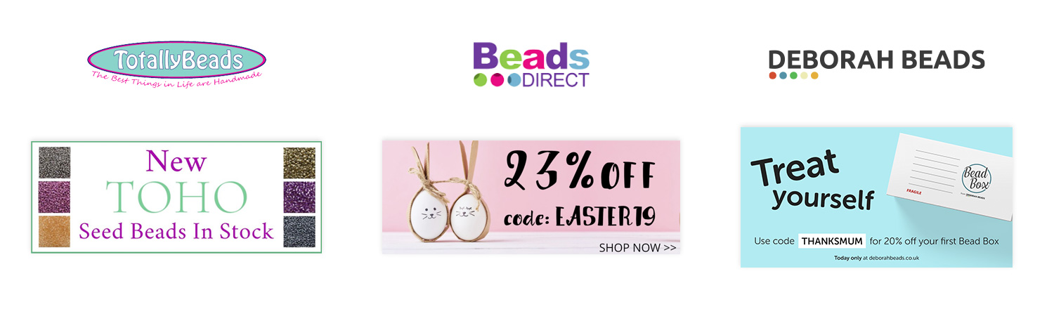
Through various acquisitions, the Deborah Beads brand had become diluted, and the company was managing three separate, distinct online businesses, each with their own brands, audiences, stock and platforms. Admin was getting more complex every day, and opportunities were being missed to introduce customers of one brand, to a different brand.
The decision was taken to merge the three websites into one under one unified brand. With this came the opportunity to completely rethink not just the website, but also the Deborah Beads brand, its marketing, and even the products that are on offer. In this project, I acted as a web designer, as well as handling the brand and marketing design.
Process
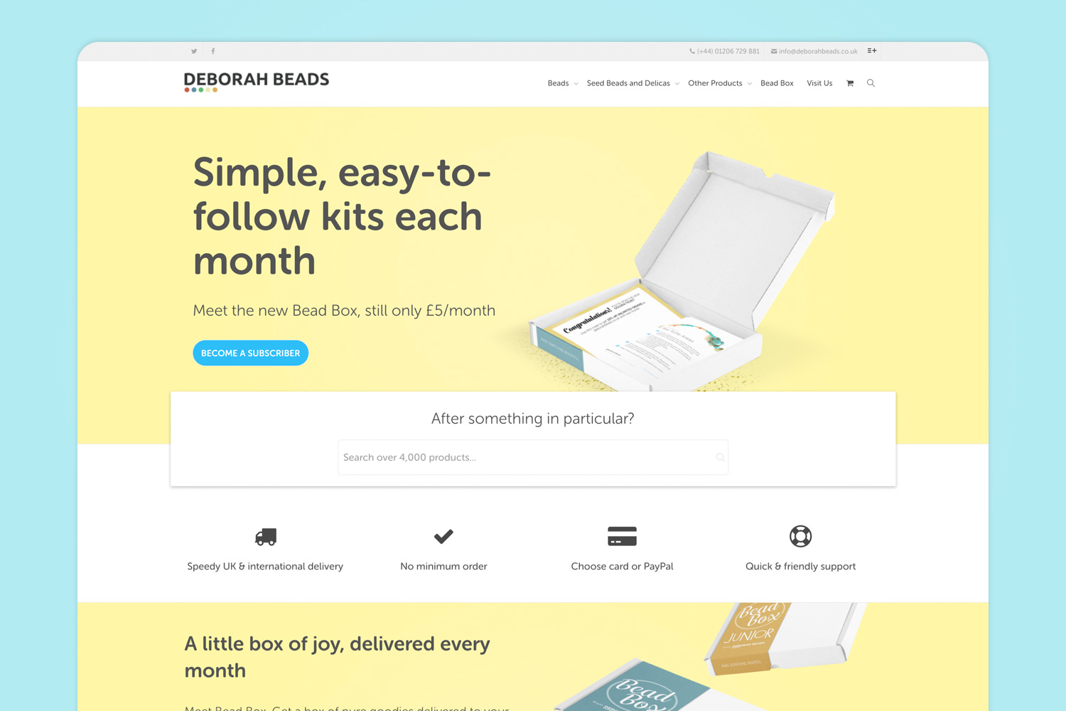
The first step was to take a step back and figure out what actually needed to be done to pull this off. The three websites had all become outdated and were no longer fit for purpose – the best way forward was to build a new, modern website built with the merger in mind. This posed the perfect opportunity to rethink the previously muddled Deborah Beads brand and modernise it with the aim of reaching a younger audience.
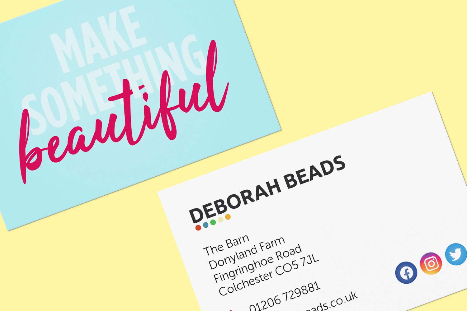
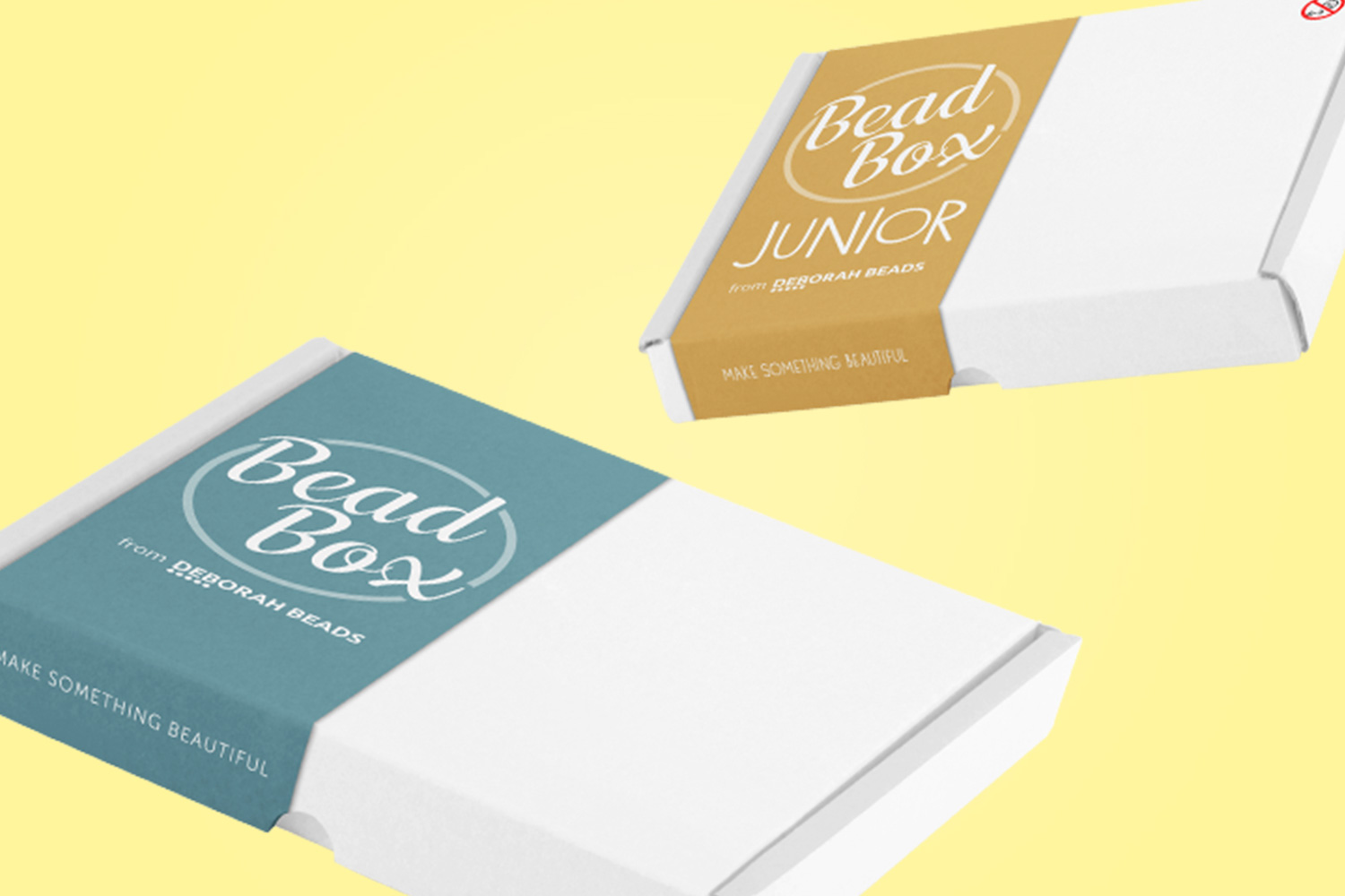
My research showed that overwhelmingly Deborah Beads’ competitors used stereotypically feminine pink and purple colour palettes, so I chose to take the brand in a different direction. I introduced a colour palette of blues and yellows supported by pinks (as well as a bespoke teal for the new Bead Box brand) which, combined with bold typography set in Museo Rounded, not only helps the Deborah Beads brand stand out against its competitors, also skews the brand younger, towards a demographic previously underserved by the arts and crafts industry.
Best of both worlds
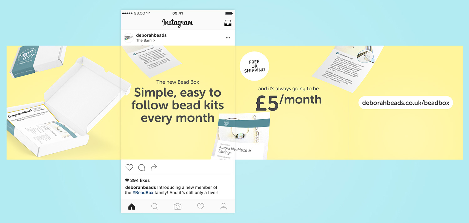
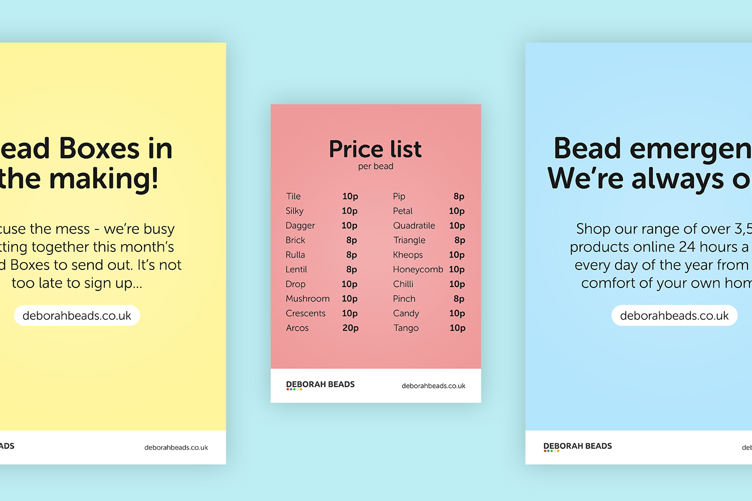
With the brand’s general look in place, it was then time to make sure the brand could express itself consistently across all of the platforms Deborah Beads is present on. As well as designing the website, this also included coming up with assets for use on different social media platforms that can be easily edited and published by other members of the team.
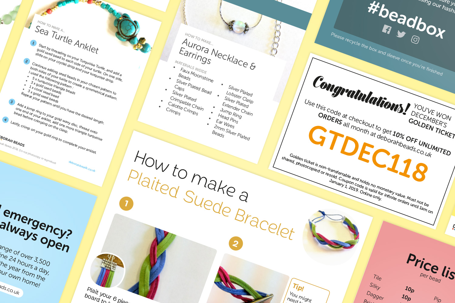
However, Deborah Beads stretches far beyond the digital world. I had to come up with a visual language for in-store signage, which combines the bold typography and colour scheme whilst maintaining maximum legibility, as well as designing print assets like magazine adverts and instruction booklets for both the Bead Box and Bead Box Jr brands.
Reflection
Overall, this rebrand and new site for Deborah Beads has been a success. Since the launch of the new site, online sales have more than tripled, and there has been a large increase in the number of repeat customers returning to the site.
This was by far the largest web and branding project I had ever worked on. I really enjoyed the challenge of creating a brand language that had to work everywhere from A2 signage outside the shop to tiny adverts on mobile phones, and learnt a lot in the process. There were some things I would have done differently – for example, I could have saved a lot of time by making sure I was completely happy with the brand’s style before starting work on the website, rather than diving in and then having to go back and restyle elements as the brand expression changed.
However, at the end of the day, I feel like this project is some of my strongest work, and Deborah couldn’t be happier with her new brand!
Since we brought on George our growth has been incredible, and it’s thanks in no small part to our new website. He knew exactly what we wanted to achieve and executed it quickly. He was a pleasure to work with!